Bhajan Hunjan CONNECTING WITH Maria Lucia Cattani

Bhajan Hunjan (b. 1956) was the 2020 Artist in Residence at Projecto Maria Lucia Cattani, Brazil. https://marialuciacattani.wordpress.com/

Link to exhibition catalogue here: https://www.marialuciacattani.com/publications-publicacoes.html

This initiative celebrates the life and work of the highly respected Brazilian artist, Maria Lucia Cattani, (1958-2015). Artist Nick Rands has invited a succession of artists and curators to respond to his late wife’s work, to use her Porto Alegre studio and to mount joint exhibitions of their own work and hers, selected from the archive of her work.

Bhajan was invited in part because she knew Maria Lucia as a friend and fellow artist when they were both based in Reading in the 1990s, while Maria Lucia was researching her PhD at University of Reading. There were parallels in their practice – both produced works on paper using a variety of print techniques. Both were dedicated teachers – Maria Lucia as Head of Printmaking at University of Rio Grande do Sul in Porto Alegre, Brazil, Bhajan as an artist educator with young people of all ages creating temporary and permanent installations in schools and community environments[1]. Both had an enduring interest in architecture: Maria Lucia frequently used the wall as matrix and support alike, printing upon and carving into its surface, producing an immersive, sensory wraparound; Bhajan has made site-specific permanent features for external and internal spaces, frequently informed by the location and the local community. Each artist derived inspiration from their immigrant cultural backgrounds: Maria Lucia’s family migrated from Italy to Brazil in the 19th Century; Bhajan’s to England in the 1960s via Kenya from Punjab (now divided between India and Pakistan). They each acknowledge the influence of textile works and ‘repetitive and patient’ tasks undertaken by their women ancestors.[2]

For the residency, due to Covid restrictions on travel, Bhajan was obliged to familiarise herself with Maria Lucia’s work only through catalogue and web images. What is it like to investigate another’s practice so closely, to examine their motivations and their influences, and yet have to do so at great distance and through the filter of reproduction? Bhajan studied reproductions closely and allowed their principles to inform a new area of practice. She found a language of soft mark-making which was derived from a spiritual connection with the work and from memories of the artist herself: a person of remarkable energy, warmth and generosity.

Bhajan focussed on the ‘script works’ produced by Maria Lucia from the early 2000s, in prints, in laser-cut artworks, in books, and much later applied directly in ink upon the wall. Maria Lucia’s script is highly distinctive, confident and delivered without hesitation, but intentionally illegible. Influenced by an early study of Sumerian cuneiform and entranced by the notion of a block as the bearer of a cursive form, she printed and overprinted in massed multiples, using colour and rotation in strict and not-so-strict ‘systems’.  These could cover an entire wall or be presented in small, folded book-forms or print on paper. She had been impressed by the beauty and ‘neutral visual appeal’ of Japanese script on her 2001 trip to Awaji, Japan, and in practices akin to the ‘allusive field of writing’ of Cy Twombly, the ‘Patterned Utterance’ of Susan Hillier[3],  began to extend her mark-making into more script-like forms, presenting in horizontal lines, experimenting with marks made with both her right and left hand.

Connecting Script, 2021

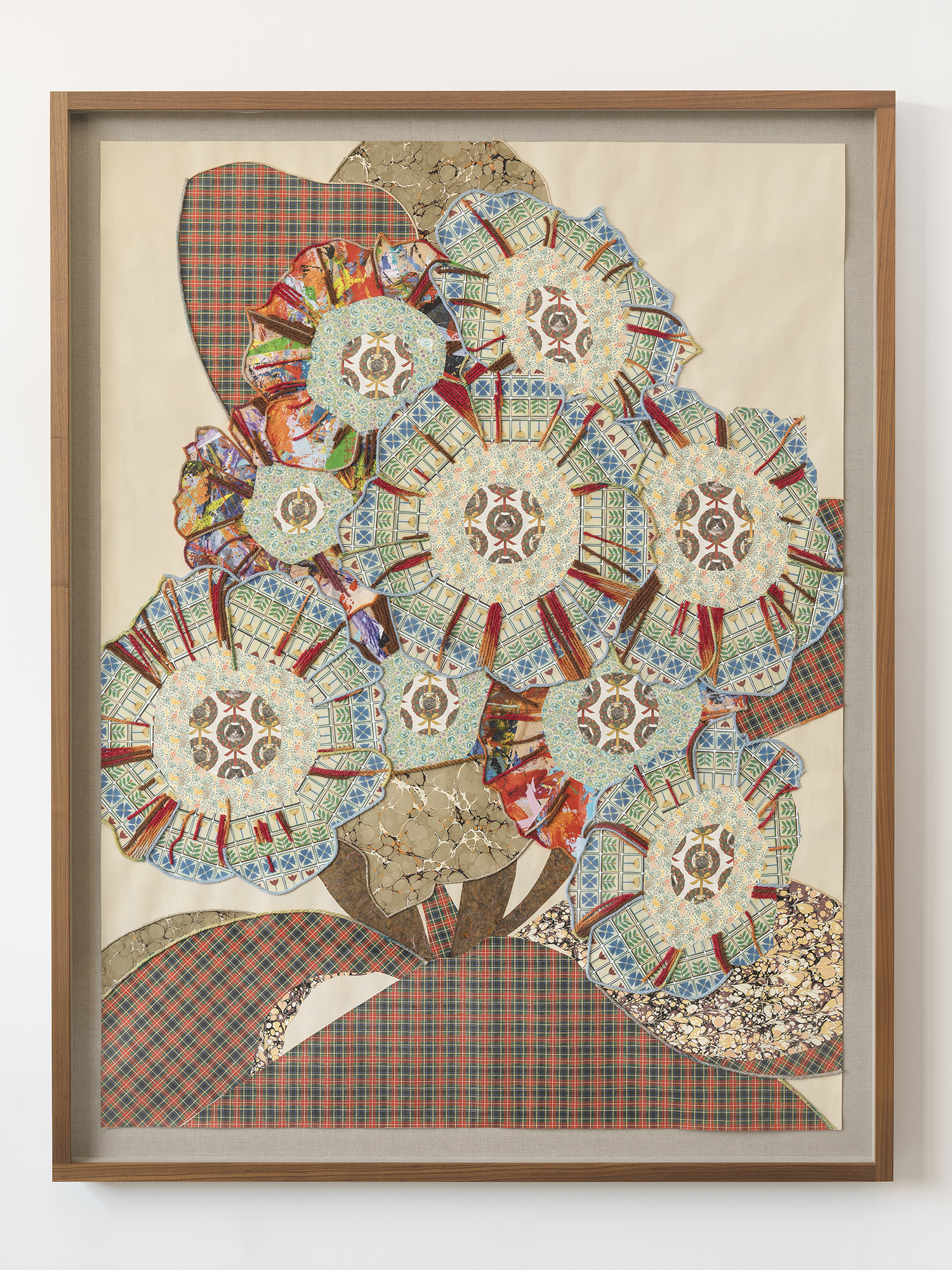
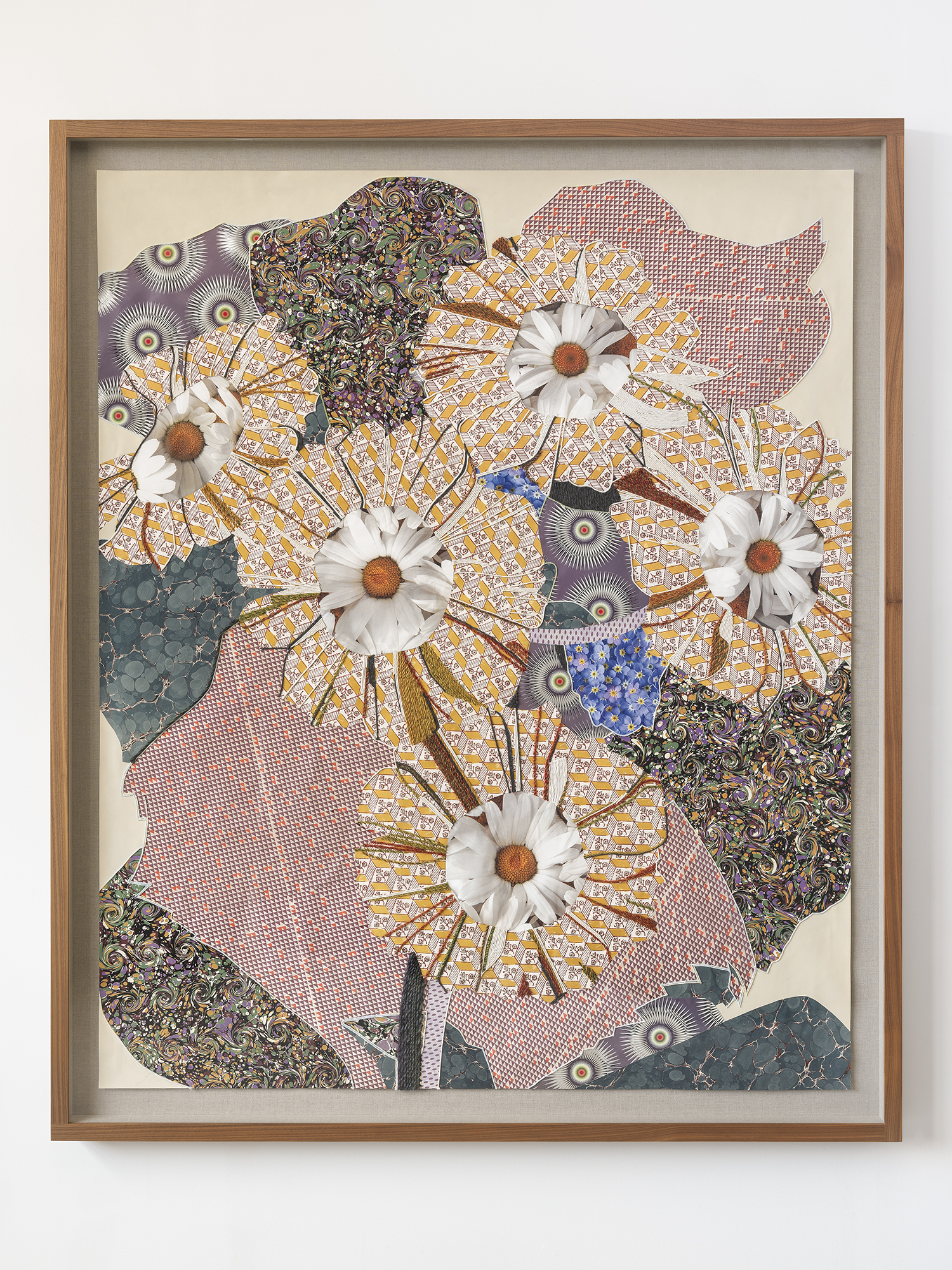
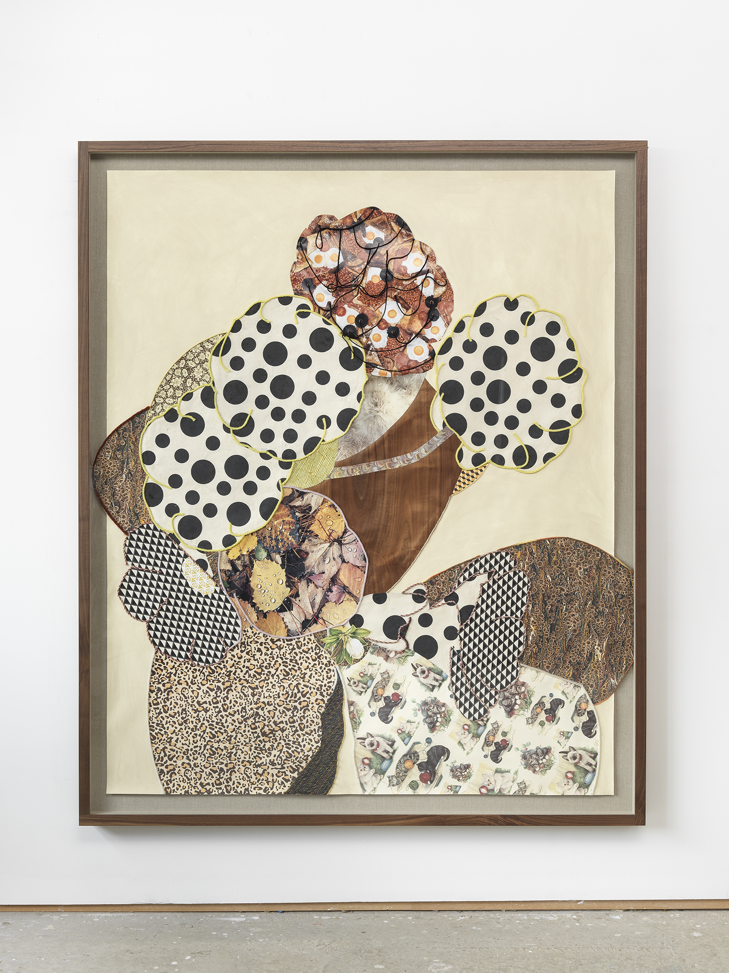
Bhajan chose to interact with this area of Maria Lucia’s work, whilst making it very much her own. Deriving inspiration from Sikh Gurbani scriptures from the Punjab, and while listening to the sacred music often sung to specific ragas. Bhajan used a Gurmukhi script[4] in a repetitious, meditative way, enjoying free, cursive mark-making. She says, “As I was writing them, I was trying to put across the essence of the sound (because for me they have a sound and meaning) and the inspiration and elation I feel when I listen to that sound.” Initially this was on a square support which was cut into smaller units. Before being used for relief printing (3 x 3 Linocuts, 2021), this surface was disrupted and abstracted, through an intuitive but rationalised and numbered rearrangement inspired by Maria Lucia’s systematic approach. What seems like simple repetition is disrupted by changes in colour and print pressure, systems of rotation, reduction printing and new pairings of cursive forms. Bhajan embraces accident as well as the structured approach of Maria Lucia: “You can be playful,” she says, “but at the same time there is strict process to it and that creates a different piece of work at the end of the day… I guess that’s the way our lives work – we think we have a plan, and we work through that plan in a very rational way, but where we end up is quite a surprise.” [5]

In a less systematic and rotational way Bhajan printed longer and more fluid blocks of script, which in turn were repeated across multiple sheets of fine paper, and sometimes bound into book form. These are repeated prints and presented as multiples, but they are not editioned; each one has a unique combination of density of inking; of harmonious and complementary pigment, in rich blues, reds and gold, in monoprinted ground colour and figured overprinting. Conjoined, they provide a rhythmic undulation, a punctuated repetition, where comparison is invited and sustained viewing is rewarded with a sensuous satisfaction. (Connecting Script, linocut on monoprint on paper, and Continuous Script, linocut on Nepalese paper, both 2021).

3 x 3 Lino on Archival Paper

Bhajan has said that her intensive study of Maria Lucia’s work led her not only to further investigation into repetition and the creative use of script, but also to a revived interest in colour. As a result, the works from this residency resonate with rich pigment, deployed in complementary transparency and opacity, each applied layer of printing activating its neighbours and its bedfellows.  

This correspondence, both material and intellectual, over time and over continents, is apt and richly satisfying. It is enacted between two women artists with a shared interest in print and paper, in repetition, in the power of script, whether legible or not, as a carrier of deeper and spiritual meaning. Bhajan Hunjan has risen to the challenge of a creative response with an intimacy of interpretation, and yet without imitation. She has devised a unique and meaningful visual language which remains creatively and culturally distinct whilst acknowledging and celebrating the work of another.

Sara Roberts

2019 Curator in Residence, Projeto Maria Lucia Cattani, Brazil


[1] https://bhajanhunjan.com/about/ (accessed 2 December 2022)

[2] Film 2, https://marialuciacattani.wordpress.com/artist-diary-bhajan-hunjan/ (accessed 2 December 2022)

[3] See Roberts, S., Regras e Suas Exeções/Rules and their Exceptions, Maria Lucia Cattani, in the monograph Maria Lucia Cattani, UFRGS, Departamento de Difusão Cultural, 2019.

[4] The phonetic writing of Punjabi Sikhs derived from Guru Anghad in the early 16th C, written from left to right and phonetically; as opposed to Shahmukhi, a Perso-Arabic script first used by the Muslim Sufi Poets from the 12th C, written from right to left, currently used by Punjabi Muslims.

[5] Film 8,  https://marialuciacattani.wordpress.com/artist-diary-bhajan-hunjan/ (accessed 2 December 2022)

Tony Hayward: Old English Furniture

The 1967 Pan edition of Ian Fleming’s Thunderball had bullet holes on the front. They were dark, photographically vivid apertures of violence, the effect of which was greatly enhanced by the fact that the holes had actually been die-cut into the cover. At the age of seven, I was endlessly fascinated by this adult’s book with a feature you could play with, like my pop-up fairy stories: you could open the book and look back through the holes, as if to verify that shots had indeed been fired.

Tony Hayward makes use of the same device in his new project. The works in this series start with the pages of a found copy of Old English Furniture by Hampden Gorden, which are then punctured. This is a 1948 catalogue of antiques, objects which were – even on publication – from another era; already we are thinking about time and history. It is plain, formal, informative. The formulaic captions detail the objects meticulously; they give dates, and describe the distinctive features, condition and provenance of the furniture. The book could not be more specific: it articulates the reasons these items may be of value or interest to prospective collectors. This informative impulse includes the images: writing-bureau surfaces are dropped down to indicate function; cupboard doors are half-opened to reveal both interior and exterior details. Things are photographed very simply, with few props – maybe a book on a desk, or china displayed within a vitrine. The object itself is the main story.

Tony Hayward has used a veteran half-centimetre circular hand punch to pierce each of these found images and reveal part of a second image, also of furniture, underneath. The particular tool is deliberately selected for the soft edges it leaves in old, yellowing paper. He has used this technique before, in his Interloper series, where he punched faces out of group photographs and neatly substituted incongruous alternatives, and other artists have too: architectural images giving to white in Rachel Whiteread’s 2005 punched postcard series, for example.

It is another commercial catalogue, however, which is to hand in the studio for constant inspiration for this project: an iconic work of graphic design, created for the furniture manufacturer Vitra in 1998 by Irma Boom.[1] This publication uses multiple pierced pages with glossy and matt papers, text and colour, found images and room-shots which include, but far from exclusively, Vitra designs. It is a rich homage to a particular era and its material culture.

Like the 1960s graphic of the rifled gun barrel at the beginning of the James Bond films, a hole within a spiral pattern, which tracks across the scene beyond until it finds its target, Tony Hayward uses the holes in his pages as viewfinders to scan, frame and focus. Each hole is made through the image of the antique furniture, not the background, and without prior consideration of what lies on the image beneath. The marrying up of the images is a secondary procedure, with its own discoveries and accidents. The back image, present in its entirety, is merely but quite deliberately shifted around to establish correspondences between the furniture depicted in the two layers. Detail in the back image is carefully registered to fit in the aperture: the legs of tables line up; the top line of a table surface is carefully aligned with the one revealed behind; a striped pattern corresponds with striped book detailing on the front. The resolution of the two images juxtaposed by the aperture is dramatic, and comes with a shock of recognition.

We suddenly realise what we are looking at, and realise why our understanding of the objects revealed is so acute. The back images are no more and no less than pages from the 2012 IKEA catalogue, and we are so steeped in it, we only need a glimpse to know where it has come from. As a graphic entity, it is a paradigm of control, of a three dimensional reality manipulated for optimum presentation on a flat surface; by photographers, set designers, lighting specialists. Its linear characteristics are supplemented by text and highlighted products. It has an underlying compositional resonance, the power of which may be triggered by the exposure of a fragment through the smallest aperture.

The conventions of the IKEA catalogue superficially depict lifestyle, as suggested by the coalescence of props, of co-ordinated and quirky massing of hundreds of products from the same store. We know from experience that the glimpses of pages beneath are of entire room layouts, patchworked generic ranges of chair, or amalgams of configurations of different products brought together in fictional home settings. IKEA, with its ubiquity, its clever marketing and exotic product names, has permeated our material culture, and our acceptance of its processes is quite universal. In the everyday reality of IKEA, ‘Billy’ is a bookcase, and we dine out on tales of the difficulties of assembling a flat pack with essential parts missing.

There are juxtapositions here, clashes even, not just of form, but of culture and language: the wilful curiousness and craftsmanship of a Chippendale tripod table ‘with “cabochon” to knees and massive lion-paw feet’ meets the vernacular of mass production – riveted joints, square tubular limbs and chunky laminated surfaces. One kind of language of making, of construction, is overlaid upon another.

The connotations of colour, introduced to the black-and-white front images through the holes, are telling. A currently fashionable gentian blue from a painted room set background, becomes, in the context of a Chippendale drawing table, the rich hue perhaps of an oriental rug or an antique wall-hung tapestry. Stacks of linen in contemporary deep-dyed colours animate an 18th Century mahogany winged cabinet intended for leather-bound tomes.

This work’s real strength lies in its sculptural rigour. It exploits the transformative power of the die-cut punch, as powerfully as bullet holes in an Ian Fleming novel. It applies the sculptural force of the aperture, which does not exist in the circle, as a mechanism for superimposition and contrast, correspondence and dialogue. An awareness of the three-dimensionality of the front image is heightened through its juxtaposition with the one behind. The technique animates the portions of the image we read as positive and negative space, transforming our understanding of what is present, what is absent. In one work, a white line on a period cabinet reads as a chair leg; it comes in and out of solidity within the hole. When two tables from different eras are laid one on the other, the resulting forest of legs can be read as connected – and the image is refracted forwards, seemingly coming out of the plane of the paper – creating a new dimension which is entirely other than those of the two catalogues.

Artist’s Book available from: https://tony-hayward.squarespace.com/shop/old-english-furniture


[1] Workspirit Six (1998) Irma Boom, Vitra

Human Being: Andrew Carnie

Written for the artist’s  exhibition Illuminating the Self at Vande and Hatton Gallery, Newcastle, with Susan Aldworth, 16 Jan – 29 Feb 2020.

Andrew Carnie has established a highly distinct area for practice, yet its boundaries are fluid and constantly changing, constantly under question. It is not illustrative; it is yet not even emotive, as such. It asks: how do we re-think being human? Carnie aims to ‘make a piece that allows us to have purchase on our feelings, that sets us to reflect on how we think about the world.’[1] It is important, he says, to raise these questions, to challenge the usual public opinion, to toggle between fear and complacency about scientific breakthroughs. The practice is, of course, separate from the practice of science itself; Carnie has described himself as an interloper[2]

Against the grain of categorising visual artists as purveyors of a single concept, or one chosen medium, Carnie’s work encompasses enormous range, possible partly because of his prolific outputs, from tech-heavy, immersive light installations animated by slide-dissolve sequences, from constructions and accreted painting, right through to watercolours, from the delicate to the surprisingly robust. Time is a crucial factor. His relationship with technology embraces the very slow as well as fast new discoveries and adaptations. His use of slide projectors and the slow dissolve in immersive environments slows down the consumption of the work: considerable time is needed to witness the ‘reveal’ of cumulative slices of the human body and an exploration its systems; and a sense of temporal scale is further disrupted by analogies between human and dendritic forms. (Magic Forest, 2002) More recently, he has rediscovered a playful approach, a licence to experiment in a lighter way that has come with maturity, to enjoy the processes of making and encourage an openness to unexpected outcomes and new ways of rendering ideas. This gives rise to the impression of a thoroughly biological practice, in more than one sense: the output of a visibly restless, energetic individual who is forever drawing, it is a teeming bloodstream of parallel ideas and forms, in constant Darwinian competition.

There is a social and professional energy at work too, a pragmatic resourcefulness which has developed into an integrated, coherent practice offering mutual benefit to the science it reflects. Carnie has found that scientists value art, that they are inclusive by culture. Repeat collaborators such as Richard Wingate, King’s College neuroscientist and Head of Anatomy, have extended his reach and his influence: Carnie now teaches King’s biomedical students 3D printing for medical purposes, and recasts what they do through artistic eyes.

Carnie’s desire for connection and cross-disciplinary activity has been the catalyst for his involvement in an international forum of artists who share a similar curiosity about the human condition and its relationship with science, who investigate the moral issues around technology and medicine, and whose transdisciplinary practice is immersed in the research lab. These include Adam Zaretsky (US), who investigates the moral issues around biotech and recognising microbes, insects and plants as creative agents, and places himself in lab conditions as a subject for study; Pascale Pollier-Green (BE/UK), who works with anatomical medical modelling as the basis for her sculptures; Marta de Menezes (PT), who uses biology and biotechnology as new art media, editing genomes of genetic modified organisms to ‘revert’ them to wild type; Nina Sellars (AU), who creates anatomical imagery using new technology and harvested body fluids; performance artist Stelarc (AU), who creates new interfaces with the body through physical intervention, including extreme body modification; and Helen Piner, who has worked with cardiac physiologist Mike Shattock to re-animate a pig heart at Dublin’s Science Gallery.

Carnie has used his remarkable breadth of facility to address an issue most pertinent to our age: the question of what it is like to occupy a human body in an age of breakthroughs in understanding of its functions and weaknesses, of medical hybridity, experiments in transhumanism, and rumours about them. Some of the great scientific breakthroughs of the last 15 years have been human-scale: broaching issues of the brain and depression; organ replacement; nanotechnology deployed for therapeutic purposes; gene therapy. These raise issues which lie beyond empirical results and objective successes: of culture and ethics; emotional response; the effects on social interactions and family units; and ideas of boundary, in the context of heart-transplantation, (Heart Project, part of Hybrid Bodies, An Artistic Investigation into the Experience of Heart Transplantation, 2015-18).

With his early training in chemistry, zoology and psychology, Carnie is well-suited to the field, and has also adopted it for pragmatic reasons. The habit of encouraging artistic research as an adjunct to scientific and medical research has been supported by foundations such as Wellcome for around 20 years. They seek not just wide understanding of health and medicine, but a broader social involvement, which notably includes the work of artists. In the last decade this impulse has led to the establishment of the global network of Science Galleries, funded by Google, to publicly showcase the rich territory between science and art. Artistic practice has shifted from being an interpretive tool, deployed post-research, to a research tool in itself, allowing new perspectives. Carnie has been a key figure in the field internationally throughout this period, and has seen it grow into a broader, more inclusive practice. His work has both stimulated and witnessed this ‘collider’ phenomenon, ‘accelerating the impulses of art and science together, to creative/revealing effect’.[3]


[1] http://www.medinart.eu/works/andrew-carnie/

[2] ibid.

[3] Michael John Gorman , outgoing CEO of Science Gallery International ,in an address to MuseumNext in Dublin, 20 January 2018. https://www.museumnext.com/article/building-the-global-science-gallery-network/


…regras e suas exceções…. (Rules, and their exceptions) Maria Lucia Cattani

In April 2019 I was invited to Projecto Maria Lucia Cattani, Porto Alegre, Brazil, to be curator-in-residence. The exhibition I selected, for Galeria Maria Lucia Cattani, Universidade do Rio Grande do Sul, and a contextual essay is contained within this neat catalogue:

Link here: https://bit.ly/31h15J0

It is also within a more substantial monograph published by Universidade do Rio Grande do Sul December 2019.

Some installation shots of the exhibition here:

http://www.gestual.com.br/arq/expo_regras_e_suas_excecoes.htm

“We can’t impose our will upon a system. We can listen to what the system tells us, and discover how its properties and our values can work together to bring forth something much better than could ever be produced by our will alone.”[1]

There was a pivotal point in 1996 when Maria Lucia Cattani began using small-unit rubber stamps, a light-touch, portable, tiny unit within which to explore her interest in repetition, chance and internal reproduction within her work. She rapidly carved with a gouge simple and spontaneous marks, lines and shapes into rubber blocks (and occasionally, intaglio units, cast wax or plaster) which were then inked up with gouache and built into larger works. She thought of these not as personal marks, with concomitant authorship and meaning, but as human marks, the act of the hand upon an object. Once cut, these were selectively used for producing larger works according to systems of overlay, repetition and rotation: self-imposed algorithms of manual procedure. A key skill of the printmaker is registration: she subverted this convention through rotational systems, and overlaid one print with another. As the unit had become smaller, the works conversely were not restrained by size: these systems, once devised, might be applied to wall, to paper, to book, to sculptural object: they were scaleable, flexible and reproducible. This switch to small units was a key to her distinctive conceptual approach; it unlocked the possibilities of a new density of repetition, and an interrogation of the potential of simple marks of the hand. This selection is from a practice governed by a very particular discipline, but shot through with an exhilarating willingness to defy that discipline.

A desire to leave behind, after more than fifteen years, the physically challenging and toxic chemicals of etching processes, caused this shift of focus. She was previously known for making painterly, large-scale, dense abstract expressionist prints, with the boldness and density of the monochrome print works of Robert Motherwell and Hans Hofmann, Iberê Camargo and Chinese brush painting. By 1990 she was combining intaglio and woodcut print in the same rich tonal works which she began to present in multiples, latterly repeating and rotating images, and connecting them across seams and paper borders. (Use illustration of 150 x 150 intaglio, 9-piece work here in catalogue) She said: 

“..the juxtaposition has a double function; it divides and it connects at the same time. It divides because one can see the materiality of the paper in many sheets. It also connects since one can see the lines and the shapes going through all the pieces of paper as a dialogue between parts seeking each other.”[2]

There is an early bookwork, Book, (ask Maristela for date?) probably from the 1980s, which signposts her interest in the juxtaposed and corresponding mark. It is a simple A5 structure, made of layered paper, the top layer cut through and the cut separated. It “takes a line for a walk”[3] through its pages, each junction corresponding with the next in spine and page leading edge. It’s an essay in pragmatism: it is not even glued, but secured with paperclips. It uses the least possible intervention to make a dynamic, articulated and layered work, and is a precursor to later calligraphic mark-making and the juxtaposition of printed sheets and the correspondences between them.

In the late 1990s she began producing printed works at various scales, and on different supports, from paper to wall, labelled objectively with the number of variations possible with the units and colours selected. She always acknowledged the existence of subjectivity in her selection of which cut block to use for making the matrix, which colours to use; which habit of rotationto deploy. She was systematising a strategy, embracing human fallibility within a schema with rules, and her thinking was objective only to an extent: “I am not interested in all possibilities, but in some visual possibilities, made with my hands and my control.” Initially, these multiply stamped images were widely spaced, as in 64-100 Ochre 1996, allowing contemplation of difference, of progression from one tiny image to another through rotation and colour charging, here successively printed in ochre, black and magenta.

By Blue 1600, 1998 (now not in show, catalogue only) the works had increased in density: this is first printed in multiple blues on thin strong Japan paper and then overprinted off-centre with ochre, on a grid with parameters and strong axes, but spaced by eye. The irregularities of this system, with its eccentric fissures between rows and columns opening up in the surface, reward closer inspection; the whole is a dynamic, flickering accretion of layered modulated colour and tiny gesture, each unit inviting comparison with its neighbour and with others similar but subtly different. She investigated the possibilities offered by the discipline of repetition and system, a devising of a conceptual model for the work, where the creative activity is the work itself, and the varying outcomes a manifestation of that activity:

The use of numbers, which represent rotations of the block, amount of colours and dimension, is a way to relate the work to abstract thoughts and ideas. Because of their intrinsic infinite possibilities, I use numbers as instruments to organize and rationalize spontaneous marks and to discuss possibilities. Numbers of plates, numbers of colours, numbers of repetitions orchestrate my work. Numbers unfold infinite possibilities. Possibilities imply variety; variety indicates transformation, which is a fundamental force in life.”[4]

She was at this time living overseas, uprooted to the UK and with designated time out of her usual teaching rhythm to articulate her theoretical interests alongside a dense practice for her PhD at Reading University. In her interrogation of the relationship between idea and practice, she wrote:

Practical problems, handling of material, learning new techniques, physical involvement in the execution, are essential to my work. For me, what I produce is not an illustration of ideas but a complex and mutual transformation between concept and execution. There is a distance between intention (ideas and concepts) and gesture (action and materialization). I believe that it is in this gap that the work happens. It is not where a mere combination of concepts and material elements occur but where they are mutually transformed.”[5]

The gesture of cutting the surface of small blocks became analogous to a cursive action, tightly contained; she had an abiding interest in ancient Sumerian cuneiform, for the notion of a clay block bearing a cursive image. Later these ‘meaningless’ marks became more fluid, less separated by the divisions of the unit, arranged in a linear and then a block of linear gestures. A 2001 residency in Japan presented her with an environment filled with much unreadable (to her) script and the beauty of foreign calligraphy. She began to extend her mark-making into more script-like forms, presenting in horizontal lines, experimenting with marks made by both right and left hand. These became practised and fluent, with the neutral visual appeal of Arabic or Japanese script to those who cannot read it. What is notable is the urgency with which she ‘wrote’; unhesitating and confident. It is akin to the ‘allusive field of writing’ of Cy Twombly[6], the ‘patterned utterance’ of Susan Hiller[7]. Script drawing, 2001 is an early example, and she later evolved a highly distinctive experimental writing, which was treated in various ways in books, in individual works, even an illuminated manuscript based upon wall decorations in the xxx (ask Nick) venue for Um Ponto au Sul 2011.

Some of the physical vocabulary of the printmaker, the cutting into surface with a sharpened tool – then coaxing ink into groove (intaglio) or laying it upon the surface (relief) – was for her transferable to wall: instead of constructing architectural motifs she commandeered the architecture itself. She said:

“I am interested in the wall because of its temporary basis as a surface for a brief interference, where the space is modified for a moment, and then returns to its original state. Permanence is not an important element. The piece has an ephemeral condition with regard to a specific space, but it is kept as a system with the possibility of being applied in other spaces. The wall has dimensions and an actuality of space which cannot be explored on paper. Some works require large surfaces which would be difficult to produce with paper. The flexibility of the rubber block facilitates the impressions on a vertical surface. Walls provide the support for larger pieces and at the same time offer a space which can involve and embrace the viewer.” [8]

She spoke of how fundamentally different this was for her, as a vertical body working on a vertical surface: printmaking is customarily largely a horizontal activity, all pressure and gravity. The wall became not only support, but it had potential to become matrix also, through the action of cutting directly into its surface. The way was paved for this by an astonishing suite of cardboard print/reliefs Untitled 2004. Technically hugely innovative, and demonstrating a facility with the accretive and reductive potential of a range of printmaking processes, these quiet but powerful prints exploit the potential of a support altered by gouging (left side impression), transforming the matrix back into an offset ready for a secondary impression onto the right side panel, in each case, in two overlaid colours. What is negative on the left becomes positive on the right, the slight mis-registration lending a shimmer of the exposed colour printed beneath.

Carmim, 2005 shows the effect of gouging/cutting directly into a gesso support already printed with tiny rubber blocks over a painted surface, further animating the surface colour and providing a paced unit and rhythm for contemplation of the whole. The cut surface becomes an even more dominant figure in later wall works, with strong deep gouge lines mapping the painted and printed squares on gesso panels. In A5 P8, 5ª Bienal do Mercosul, Porto Alegre, the spaces between these initial dominant cuts are peppered with tiny figures in the form of smaller gestural gouges, a rapid disruption of the smooth surface. She asserted that there were five, equally valid, manifestations of this conceptual work: the (site-specific) wall painting itself; a frottage made from the cut surface of the wall; a documentary video; an inkjet photographic print; a text.[9]

She embraced the use of many technologies through her career, including ink jet printing for works and bookworks, and laser cutting for producing precise woodblock matrices. In Seis Sentidos sem Sentido 2009, the oil painted surface has been shallowly laser cut, exposing layers of different coloured underpainting. She exploits the notion of surface; what is below may be brought to the fore, what is above may be backgrounded by the figure. In using a cursive script as image in a painting, BV1 2013 the ‘negative’ is given equal weight as the positive – the spaces around each figure are meticulously delineated and given substance. Layering ‘script’ further obscured any possible reading of meaning, and systems of colour and order are imposed, in as in Laser-cut woodcut print 2011 (Not in show – catalogue only).

Latterly, direct drawing and painting opened possibilities of communication denied to her by her declining health, and the cursive developed into an urgent mode of delivery. Amongst her last works, Drawing 2014 and Painting 2014 are evidence of sheer willpower and the belief in repeated action as a means of expression. All notions of ‘lines’ of script have disappeared, to be replaced by an instinctive balance of marks across a surface; in the painting these are depicted as positive and negative figures, in equal measure in complementary colours. They are built of a distinctive vocabulary of small calligraphic squiggles which share a gestural commonality but in actuality are unique, and invite comparison and contrast.

As she said previously:

Exact repetition does not exist.It is purely an abstract concept and in reality nothing can be exactly repeated. From the starting point of visual repetition we enter a labyrinth of differences. We look for the relationship between objects and for their differences, because of our desire for diversity. The initial neutralisation of individuality imposed by repetition is denied, and individualities are established again. In the process of repeating we eliminate the anxiety of the unknown. We know and we repeat. We are not thinking about the future. Repetition is present tense. It is the confirmation of the present.”[10]

Sara Roberts April 2019


[1] Meadows, D.H., from Dancing with Systems, (previously unpublished) quoted in Systems, ed. Shanken, E.A., (2015) Whitechapel: London p61

[2] Cattani, M. L., (1990) MA thesis, Pratt Institute, NY (ask Nick for reference) p4

[3] A drawing is simply a line going for a walk” anecdotally attributed to Paul Klee

[4] Cattani, M.L., Spontaneity, repetition and systems in reproductive media: a reflection on personal practice. (1998) PhD thesis, University of Reading. pp52-3

[5] Cattani, M.L., Spontaneity, repetition and systems in reproductive media: a reflection on personal practice.  (1998) PhD thesis, University of Reading. p121

[6] Roland Barthes, Cy Twombly: Works on Paper (1979) Whitney Museum of American Art

[7] Susan Hiller, ‘Looking at New Work’, an interview with Rozsika Parker, in Thinking about Art, Conversations with Susan Hiller, (1996) edited Barbara Einzig, Manchester University Press: Manchester.

[8] Cattani, M.L., Spontaneity, repetition and systems in reproductive media: a reflection on personal practice. (1998) PhD thesis, University of Reading. p34

[9] Cattani, M.L.,  A5 P8: o texto, (typescript) 2005

[10] Cattani, M.L., Spontaneity, repetition and systems in reproductive media: a reflection on personal practice. (1998) PhD thesis, University of Reading. p91

Georgie Hopton: Within a Budding Grove

Review for Crafts Magazine, May-June 2019

Georgie Hopton: Within a Budding Grove
Lyndsey Ingram Gallery, 27 Feb – 5 April 2019

Georgie Hopton_The Bonnie Lasses_Monoprint with collage_2015

Georgie Hopton,The Bonnie Lasses, monoprint with collage, 2015


Three distinct bodies of work make up this Georgie Hopton presentation at Lyndsey Ingram Gallery: prints/collages; large-scale Auricula collages; and applied art outcomes for wall, textile and floor. These are presented in a constructed domestic setting, the brightly-lit, usually white-walled London mews gallery now hung with Georgie’s hand-silkscreened wallpaper, one room sporting a dado suspension rail to show fabric with a mid-century feel – undyed, raw linen background supporting a simple block-printed motif, a rural Morse code of a pattern, replacing dot-dot-dash with radish-radish-stem, in the strong tradition of the great British female Modernist block-print textile artists Barron and Larcher or Enid Marx. The ’Stromboli’ rug, produced in an unlimited edition by Christopher Farr, emphasises an Arts and Crafts approach conclusively catapulted into the digital age: it is hand-knotted, but digitally derived from a photograph of a hand-cut, collaged, printed paper and stitched work in a moulded plaster, faux-rope frame. By the time of its photographic reproduction in the gallery catalogue, processes have been layered to an extraordinary degree, and the toggling between surface and relief, handwork and high tech, reaches a dizzying peak.

Georgie Hopton_Shining Hour_Monoprint with collage_2015

Georgie Hopton, Shining Hour, monoprint with collage, 2015


Hopton lives and works according to the seasons, migrating periodically to follow the imperatives of planting and harvesting times, switching studios and pace of life. She does not eulogise the rural, but brings it into contact with a sharp urban practice and a designer’s sharp eye. Her year begins an ocean away, with a two-week stint in May planting up her extensive garden in the house she shares with husband Gary Hume in rural upstate New York. She later returns to spend the bountiful part of the summer there, tending her crops and harvesting food to sustain her family and her art, a period of both intense physical industry and contemplation. Barrowing vast quantities of her produce into the studio, she uses cut surfaces to make her ‘Veg Prints’: super-light drawings in natural materials and wool; leaves and dots and shapes rendered in printed acrylic paint through the direct application of vegetables to the surface, as pragmatic printing blocks, or, in some cases, the plant matter itself. Grown produce provides image and tool: stickily over-inked acrylic paint on cut surfaces of dense vegetables, the suck and shear as the object is removed providing surface texture which may denote vein or nap: radish, crookneck courgette, squashes, potato, sparingly arranged on thick paper. Playful, spare drawings, sometimes including collaged-on, distinctive leathery leaves of Viburnum rhyditophyllum, encapsulated in paint. Sleekly rounded forms, with woollen-yarn connections and gestures, pace across the page. Beautiful individual runner beans, with their intricate patterning, are applied like punctuation to the rhythm of a work – full stop or nipple or grounded mark, depending on your reading. They have something of the biomorphic abstraction of Victor Pasmore, something of the eccentric joy of Roger Hilton.

Georgie Hopton_A Season of Flight (xviii), Monoprint with acrylic, leaf, sticks and collage on paper, 2016

Georgie Hopton, Hopton – A Season of Flight  (xviii), monoprint with acrylic, leaf, sticks and with acrylic, leaf, sticks and collage on paper, 2016.


The work from the London studio, and mostly the Winter months, takes a different stance and is produced on a larger scale. Images of Auriculas are pared into intersecting areas, a kind of schematic using the form of this most hybridized of flowers. Auricula, the result of human intervention in the life of the humble primula, is the ultimate collectable plant, fashionable in the Victorian era for its ability quickly to yield new zoned colour combinations, displayed back then in black-painted ‘theatres’. Hopton’s works are, however, the opposite of the botanical study, with no modelling or shading, an uncompromising graphic infilled with the found graphics of others. Hopton keeps a vast collection of papers in her London studio: red brick; foil; tartan; wood veneer print; Victorian-cat-in-laurel wreath motif; Japanese washi paper; tile reproductions; marble and other endpapers; floral designs; spin paintings, and they all appear here juxtaposed and variously harmonising and clashing. They are reminiscent of North American patchwork, in that motifs are repeated across a surface, but the scale of the motifs frequently disrupts any harmonious reading. These are far from the flowers as sexual organs of Chadwick or O’ Keeffe, however: emotionally cooler, more formal in design. Nor are they in the illusionistic/decorative domestic craft tradition of Victorian découpage. This is a striving for a new language, delivered with confidence and an aesthetic provocation.

In this 21stCentury transatlantic practice, its origins firmly rooted in early 20th Century British Romanticism, Hopton has developed a material resourcefulness derived from a concern for a way of living which is immersively creative, and a distinctive vocabulary, derived from childhood associations: her late mother knitting second-hand jumpers into new garments, or the texture of printed papers on walls and packaging. Found colours are not necessarily ‘good taste’ – the colours of 1970s handknit jumpers somehow lending ochrous weight to the ensemble. Stitched or stuck to the collaged surfaces, woollen threads act as highlight, articulation, stem or stamen, and animate and aggravate the flat-patterned surfaces out of tasteful blandness.


Georgie Hopton_Witches' Butter_Collage, wool and string on painted paper_2019

Georgie Hopton, Witches’ Butter, collage, wool and string on painted paper, 2019


About Georgie Hopton

Georgie Hopton was born in 1967 in the UK and studied at St Martin’s School of Art, London in 1989. Her works in photography, collage, printmaking and sculpture are made in conjunction with wallpaper, fabric designs, unique and editioned rugs.

Self portraits, studies of flowers and still life are consistent subject threads, woven through forays into abstraction and decoration. Her heart lies in creation with no boundaries, the melding of art and life, the one reflecting and intersecting the other. Shows include; The South London Gallery, Milton Keynes Gallery in the UK, and Brancolini Grimaldi, Rome. Her work is housed in several permanent collections including the Arts Council Collection and her public art commissions can be seen at The Home Office and Royal London Hospital.

Hopton was nominated for the Max Mara prize in 2007.

Women Power Protest: Gender and Diversity

Visiting Women Power Protest at Birmingham City Museum and Art Gallery (BMAG) for the ACC Curators’ Day (15.11.18) was a way of connecting with old friends, making new contacts, and discovering unexplored aspects of the Arts Council Collection. Lucy Gunning’s video Climbing Around My Room (1993) is the naughty school-friend it’s so great to catch up with – the idea of dressing up in party gear and clambering around your room at picture-rail level, in order to gain new perspectives, is awkward, subversive, still funny after all these years. Of course I have never actually met Melanie Manchot’s mother, but it was glorious to see her again, in her oversize, honest, intimate photographic portrait Mrs Manchot, Arms Overhead (1996). I had wanted to see, but had never before, Mary Kelly’s hugely influential and pioneering account of early motherhood, Post-Partum Document (1973-79), painstakingly etched into slate and inscribed on nappy liners, I guess in all those sleepless hours.

I nominate Eliza Gluckman to be my new friend. She is engaging, persuasive, a bit angry. She delivered to the group of curators a rapid, taut account of a coherent body of feminist curatorial action: Liberties, (2016) curated with Lucy Day, an exhibition of contemporary art by 24 women artists reflecting on the 40 years since the Sex Discrimination Act; Taking Up Space, (2018) curated with Dr Laura-Maria Popoviciu, profiling women artists from the Government Art Collection who challenge public space; A Woman’s Place, (2018) allowing women a new voice in the National Trust property Knole, home to, but not inherited by, for misogynistic primogeniture reasons, Vita Sackville-West. All this, backgrounded by really startling statistics about gender balance in public art. We are aware of the Guerilla Girls’ actions in US art collections, but the figures in the UK are equally sobering. Eliza helpfully supplied some: the Fawcett Society’s ‘Great East London Art Audit’ (2014) audited public artworks on display in London: 70% were by male artists, 30% by women. More shockingly, of 43 pieces of public art in East London, 14% were made by women artists, 86% by men.There are 386 public works of art on display in Westminster and the City of London, of which 8% were made by women artists and 92% by men.

Scheduled in this year marking 100 years since the first women won the right to vote,Women Power Protest goes some way to redressing the imbalance, with its 100% female line-up. It covers historic and contemporary works and is structured around slogans from the Suffragette flag: Purity,“obviously”, according to BMAG curator Emmalee Beddoes- Davis, “…now updated to Activism”, Hope and Dignity. The layout is sensitive to the vulnerabilities of visitors, with distinct areas for works which may offend or trigger memory of past experiences, and appropriate advisory panels and designated maps to enable planned visits. The massing of works caused by this process juxtaposes Sam Taylor- Johnson’s glorious Gothic letterpress Cunt. (1994, from the Other Men’s Flowers print portfolio) with distressing works about Rape (Margaret Harrison, 1971), and childhood sexual abuse (Sonia Boyce, Mr close-friend-of-the-family pays a visit whilst everyone else is out, 1985).

Speaking to the group, and surrounded by graphic representations by Stewart Eastonstewarteaston.net of Emmeline Pankhurst, Malala Yousafzai, Christine Coriado-Peres and athlete Ellie Simmonds, arts educator Jon Sleigh gave the context underpinning the social

page1image41535744page1image41535936

constructs of 21stC feminism in its global, intersectional forms. Jon advocates an inclusive curatorial approach which “holds us accountable as practitioners” and creates a safe, ‘consensual’ learning space, which was arrived at by working with marginalized communities, such as Shelter/trans/disability groups.

I also nominate exhibiting artist Michelle Williams Gamaker for new-friend status. Her bewitching film, House of Women (2016) layered process and product, past and present, into a re-examination of gender and inappropriate racial casting in the original 1947 filmBlack Narcissus. Her Indian and British Asian female and non-binary actor ‘hopefuls’ iteratively state their case for inclusion in the film and recite scripted lines. Williams Gamaker in her presentation described her work as ‘fictional activism’; returning to much- loved but flawed artefacts (period films), and providing an aesthetic and restorative overlay, all the while making the processes of scripting and filming utterly transparent.

Finally, ACC Senior Curator Natalie Rudd sketched out first thoughts on a series of exhibitions designed to redress the gender power balance in ACC projects, the 2019 Women in Sculpture research project. There are multiple reasons why women are not fully represented in collections, including some you may not have thought of, such as conservation – if a work undergoes a fallow period of not being borrowed, it is consequently not routinely conserved, and may fall into no fit state for exhibition. ACC recently commissioned Margaret Organ to re-make one of her works, Loop 1978/2015, so that it could be shown in the exhibition Making ithttps://www.artscouncilcollection.org.uk/exhibition/making-it.
Natalie, in her call for collaborators, hoped the project will strengthen “…multiple voices, not the single narrative.”

Women Power Protest: Gender and Diversity
Arts Council Collection Curators Days  blog, 12 December 2018
https://www.artscouncilcollection.org.uk/explore/blog/women-power-protest-gender-and-diversity

Johannes Nagel

There is a sense of provisionality about the works of ceramicist Johannes Nagel – we know they are finished because they are glazed, fired, and presented, but they allow for continued questioning of the concept of the vessel – what it signifies, what memories of other objects it evokes, the deep conventions of the ceramic discipline. Nagel has the agility to work in accretive and reductive ways: his vessels may be thrown, built, collaged, or cast in moulds excavated in sand.

His collaged works are made up of components which are often recognisably wheel-thrown, and which have been stacked or assembled, sometimes in discordant ways. Volume meets neck; neck meets lip; lip may hang under its own weight. They comment on the qualities of clay – to be brittle and angular, soft and pliant, smooth in places but in others harshly gritty with grogged additions. He makes and then breaks the profile of the vessel, the very principle upon which it depends. There may be a gap left between components, rendering invalid any semblance of function. Imagery or colour is deliberately superficial, applied like paint as an on-glaze, disrupting and re-establishing the lines of the work and the way it is articulated and read.

The vessels of the (New Jazz) Isolator series are like the cores made by a huge auger as it is withdrawn from the ground, bringing with it different textures and gauges of material: the strata of the earth. Vast, central cylinders, thrown and built, bear blades of clay on their outer surfaces. These are established in a regular distribution, and then variously torn and disrupted. He speaks of these works as analogous to jazz: improvised, riffing on a rhythmic form. In groups they play upon each other, while each work has its own compositional integrity.

He embraces the lo-tech of the sand-cast, using no tools and limiting his forms to those possible through the use of his hands, together and separately. The basis of thrown ceramics is the rotational form, around a central axis. Once throwing is abandoned for other techniques, there is no need to adhere to the rotational, but Nagel acknowledges the convention of the vessel by using rotation even in his cast works. He hand-gouges spaces in a loose material, imperfectly describing an orbit, before lining the void with liquid porcelain. He describes this improvised technique – direct, informed, intuitive – and the relationship between the imagined form and the result, as “sculptural unsharpness”.

Images available here:

https://galleryfumi.com/artists/johannes-nagel/

Thomas Lemut

The furniture of Thomas Lemut is typified by cool precision, a visual and structural coherence. Chairs are assembled of multiple individual pieces in a range of metals, demonstrating the inherent beauty and qualities of each, and have no welds, nails or glue – they are instead highly engineered, with mechanical fixings. Lounge chairs may be repeat profiles in ash, connected by brass rods. Desks and tables are simple forms rendered in stripes of different coloured metals or woods, or both. Lights are columnar, on tiny bases, but achieve a delicate balance visually and physically; their functional parts may be folded invisibly back into the column when not in use. There is a purity of concept and austerity of execution which belies the individual who made them – a passionate, voluble Parisien, erstwhile sculptor, labourer, bon viveur, fashion designer, film producer and artistic director; a man who believes in supporting local economies and in the value of personal political activism.

Thomas Lemut harbours deep anxieties about the current state of the global economy, and has committed considerable time to developing a re-localised microcircuit economy akin to the ‘local’ food movement. He says he would love the commissioning and production of furniture to celebrate local skills and be more integrated into people’s daily lives. Recently he has formed an initiative to work with traditional craftsmen and existing craft-based industries in the Jura Mountains. ÖST OUEST is a collaborative project with Austrian cabinetmaker and interior architect Johannes Eckhart which aims to perpetuate an ideal of working with specialists in their own environs, having them use local materials and sell direct from the locale to keep regional economies alive.

Closer examination of Lemut’s works reveals an underlying sensuality – they are simple to comprehend yet luxurious in their celebration of materials. Lemut has a deep understanding of his chosen field, and derives a large part of his inspiration from a commitment to honouring the qualities of the material. He exploits the nobility of metals, the distinctive beauty of different hardwoods. “Curiosity is what drives me,” he says. “It is a form of desire”. While he also, separately, makes sculpture with a conceptual leaning, his furniture is characterized by functionality. He does not recognise a purely decorative or sculptural notion of furniture: as with modernist architecture, function is paramount.

Thomas Lemut begins with hand drawing, perhaps surprisingly, given the hard precision of the final product. He then engineers the pieces with basic 3D software, because “there is no space for spontaneity once the drawing is done. I use my brain and my heart,” he says, “but I don’t mix the two”. The linear quality of his furniture is a highly conscious device to ‘cut up’ space and aid understanding of construction. He speaks of this paring-down of construction and purpose as a feature of ‘diligent furniture’. He strives towards an ideal of epure – purity – where there is nothing further to add, and nothing to withdraw, a certain Classicism of his own devising. He may describe himself as a touché à tout, or Jack-of-all-trades, but he is Master of the sleek and sensuously functional.

Images available here:

https://galleryfumi.com/artists/thomas-lemut/

Sam Orlando Miller

British sculptor Sam Orlando Miller grew up surrounded by silver and the highly skilled practitioners of the family silversmithing business. Using craftsmanship as a means of thinking, and resolving issues through the manipulation of materials, is therefore second nature to him.

He uses mirror, he says, because it is part of a lexicon of materials which people readily understand, and he is clearly at ease with the creative use of the silvered surface. “The skill of working with silver”, he says, “is the understanding of reflection. When you make an object in silver you need to know how it captures the world around it.” He made his first wall mirror piece to infuse a rather dark place in his home in Italy with modulated, reflected light, and the discovery that these forms had the power to animate spaces has led him to develop further wall-mounted sculptures, lighting, and tables.

For his Untitled series, Miller has devised a distinct, restrained palette of colours, shapes and surface treatments, in various materials: mahogany; lacquer; silver plate; combined with cut and patinated mirror-glass. The shapes are geometric, tessellating into illusionistic images, receding drums, and cylinders, influenced by the architecture of his adopted Italy. These speak of antique luxury, and their faceted forms are reminiscent of jewels, whose surfaces are cut to expose an internal order and beauty.

Miller has retained an exploratory attitude to materials, delighting in fresh rediscoveries of the very old, such as the recipe for bituminous black paint which was used on the original Model T Ford, and shellac found in the basement of an old Italian hardware shop, mixed with collected rust. He contrasts found patinated material with carefully applied new patinas, as a comment on the transient nature of cultural objects. Evidence of the process of making, such as tool marks on his rusted steel chandeliers and the cursive numbering retained on the mirror facets, sometimes remains as a motif. The narratives such traces imply are seamlessly incorporated into the works, which thus appear ancient, having had a life of their own in the making.

Sam Orlando Miller divides his time between London and Italy. His work is held in private collections worldwide.

Images and films available here:

https://galleryfumi.com/artists/sam-orlando-miller/

Rowan Mersh

Rowan Mersh’s experience in experimental textiles is immediately apparent in his wall-mounted, sculptural assemblages, which use hard construction to achieve a soft aesthetic. The high drama of his earlier kinetic large scale installations and his sculptural fabric works, freestanding and for the body, is now translated into a more contemplative mode, in unique wall artworks of great maturity and elegance. The works are expansive, generous in their scale, yet close examination delivers the satisfaction of individually considered parts, meticulously rendered by the artist himself.

His process is labour-intensive, involving the hand-assembly of many thousands of individual components, selected for their specific sculptural qualities when used en masse and used in organic, extensive ways. He uses responsibly-sourced materials, ranging from windowpane oyster shell discs from the Philippines, and Californian dentalium shell, with all its natural variation and idiosyncrasy, through to sticks manufactured in wood with a coating of marble dust.

The works raise inevitable questions about value: some of the shells were traditionally used as currency or sacred wealth, and leather components associated with luxury brands imply a premium; but the real worth here is delivered by the artist’s unique and dedicated vision in unlocking the creative power of these strange components. Their sheer numbers are evocative of ruffled patterns in nature – the layering of feathers, the disturbed nap of animal fur, accretions of coral, the tentacles of sea anemones. Undulations, peaks and troughs, in reality fixed, are animated by the movement of the eye across their eddying and swirling terrain, implying life, an internal energy beneath the surface.

Large-scale wall pieces may be contained within deep frames or geometric forms such as circles or squares, or are borderless and freeform, with motifs coalescing and dispersing across the wall surface. They are at the same time complementary to interior architecture and invested with an internal, dynamic architecture of their own.

Rowan Mersh lives and works in London; his works have been acquired by private and public collections worldwide.

Link to images here:

https://galleryfumi.com/artists/rowan-mersh/